
Machine Learning Dashboard
Machine Learning Dashboard
mia — May 2021

My Role
UX/UI Design — Research, Visual Design, Usability Testing, Prototyping
Team
Lien Ngyuen (UX/UI)
Vicky Lin (UX/UI)
Lien Ngyuen (UX/UI), Vicky Lin (UX/UI)
Platform
Landing Page & Forum Builder Dashboard
Timeline & Status
3 Months, Launched
Challenge
Redesign mia landing page to better communicate the features and value of their product, explore ways to make the form-builder to create web apps more intuitive to increase user engagement and drive conversions.
Impact
Outcome
Outcome
Created a new landing page that demonstrates the value of mia through animations and helps build credibility through client testimonials and constructed a form-builder that features an interactive drag and drop format where users 'build' their own web apps.
Created a new landing page that demonstrates the value of mia through animations and helps build credibility through client testimonials and constructed a form-builder that features an interactive drag and drop format where users build their own web apps.
CONTEXT
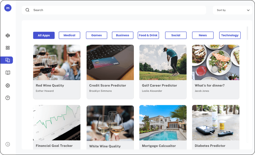
What is mia?
No code model upload
application.
Models are trained to through large data sets to imitate the way that humans learn and improve accuracy. With these models, businesses and consumers can better solve problems, make decisions, and format predictions.
While most of these model are stuck in complex code, mia encourages data scientists take it one step further by helping them deploy their machine learning models into a visual app that ordinary people can understand and use.
Models are trained to through large data sets to imitate the way that humans learn and improve accuracy. With these models, businesses and consumers can better solve problems, make decisions, and format predictions.
While most of these model are stuck in complex code, mia encourages data scientists take it one step further by helping them deploy their machine learning models into a visual app that business executives can easily understand and use.
1.0
mia main digital app view final
IMAGE
LANDING PAGE
Building mia’s new experience
Research findings
From our initial interviews, we discovered a couple key takeaways from our users about the landing page:
3.0
Landing page research findings
IMAGE

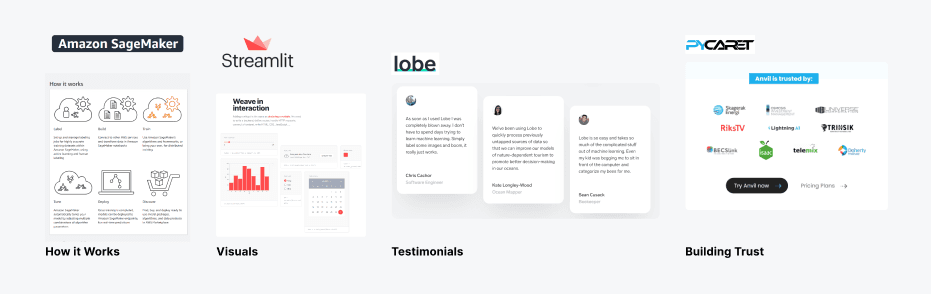
Competitive Research
We compared companies that offered similar services to mia and took a look at their landing pages and features to determine the methods that other companies have used to attract and engage users.
What mia’s landing page lacked was clear visuals, call to actions and testimonials which made it difficult for users to understand the benefits to their product, how it works, and if they should trust it.
3.1
Competitive Research
IMAGE
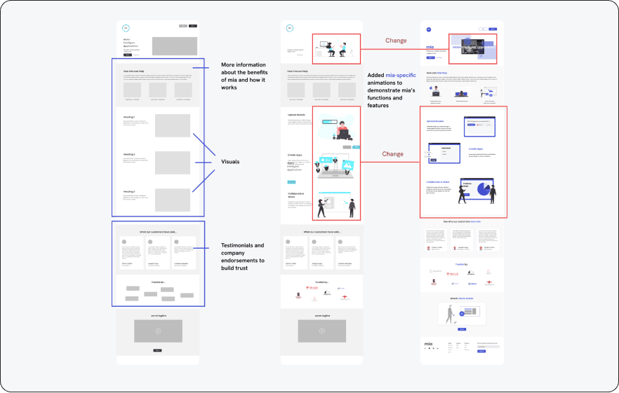
Design iterations
Our goal for the landing page was to clearly communicate Mia's value by showcasing how it works, its benefits, and its various use cases.
Additionally, we aimed to build trust in Mia to encourage user engagement and drive conversions. Below are our findings from testing the new design.
3.3
Landing Page Design iterations
IMAGE
8/8
Participants who have used mia previously reacted positively to the new landing page.
7/8
Participants felt that the images were too vague.
In the final iteration, we created animations that served as a sneak peek and tutorial for how mia works.
8/8
Participants were able to better understand the services that mia offers.
VISUAL DESIGN
Accessibility Issues
During our interviews, 12 out of 17 participants shared negative feedback about Mia's inconsistent UI, with some describing it as untrustworthy and unprofessional.
Our goal was to develop a new design system that feels polished, fosters trust, and authentically represents mia's identity.
3.3
Accessibility review of mia’s old experience
IMAGE

Color palette
We replaced the teal blue with a dark purple-blue and a vibrant blue. The blue was chosen to inspire trust, while the purple-blue adds a modern, tech-savvy, and creative touch.
4.1
Color Palette
IMAGE

Typography
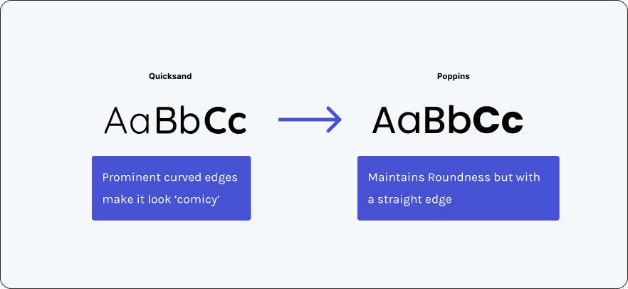
Mia's original primary font was 'Quicksand,' which we appreciated for its modern, creative, and youthful roundness. However, at larger sizes, its rounded corners became more noticeable, giving it a "comicy" feel.
To address this, we recommended 'Poppins,' which retains Quicksand's rounded charm but with cleaner, straighter edges.
4.1
Typography Comparison
IMAGE
4.1
Typography
IMAGE
APP CREATION
Learning from the best.
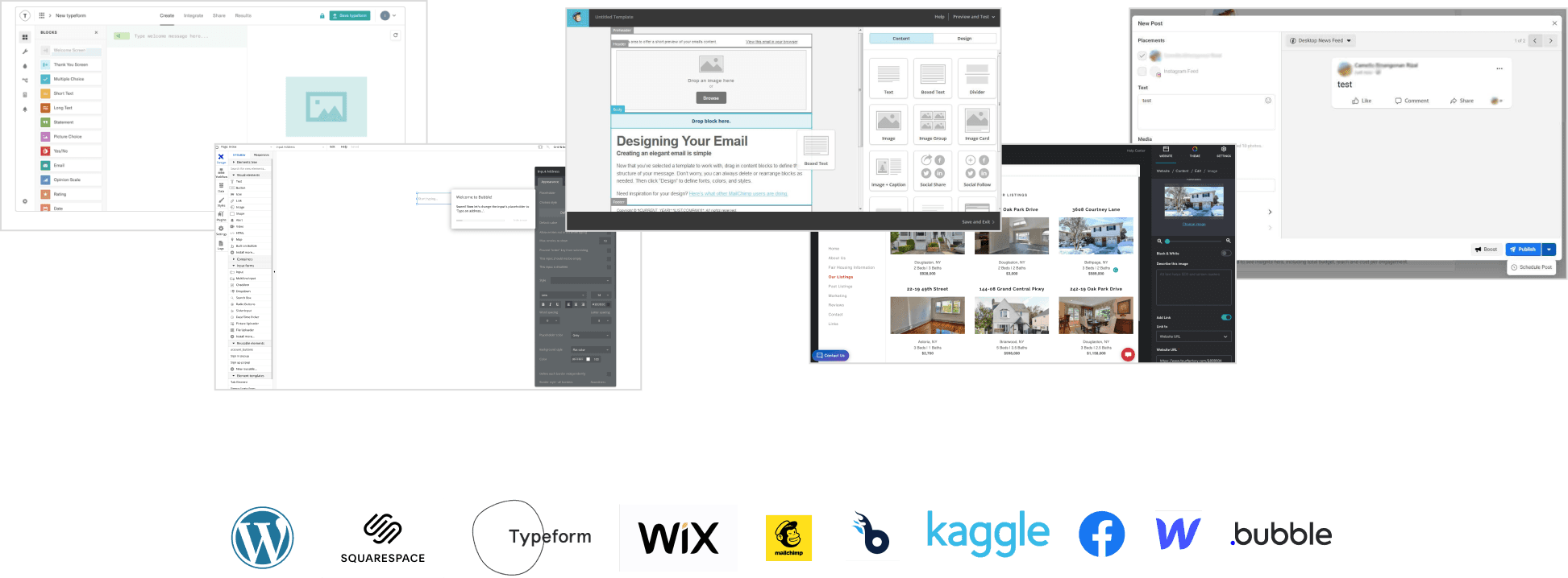
Many users described the app creation process as dull and tedious. To address this, we drew inspiration from various "builder-style" platforms, such as MailChimp, Wix, and Typeform
3.3
Element Reuse
IMAGE
Choosing a design direction to move forward with.
One key issue we identified was that users were entering the app creation process without a clear idea of what their app would look like until the very end.
Since these apps visually represent their machine learning models, it's crucial for users to see their progress in real-time during the creation process.
To address this, we developed and A/B tested two solutions in which majority of users preferred the Builder Design approach.
4.1
A/B Testing
IMAGE

Forum Builder:
Retaining the existing form builder but displaying a live preview of the app next to the form, updating in real-time as users input data.
Builder Design (User Favorite):
Introducing a drag-and-drop interface with a side panel for editing.
App Creation Final Design
After deciding on the 'Builder Design', we created different iterations of the design and continued to test with users. While testing our final iteration.
6/8 fully understood how to navigate through the builder and create their own app.
View New Changes

View New Changes
View New Changes
3.5
Final App Creation flow
INTERACTIVE
MODEL UPLOAD
Old Model Upload Process
Before users can create an app, they first needed to upload their machine learning models.
From conducting usability testing with the old process we were able to discover key blockers users encounter while attempting to upload a model
3.3
Model Upload: Usability Findings
IMAGE


4.1
Model Upload
VIDEO LOOP
New Model Upload Process
In order to simplify the form, we created a one screen form that is interactive and personalized to the user.
Users will first be prompted to select the framework and framework version of their
model and then the requirements for that specific framework would populate the screen. This makes sure that users only see the relevant information.
In order to simplify the form, we created a one screen form that is interactive and personalized to the user.
Users will first be prompted to select the framework and framework version of their model and then the requirements for that specific framework would populate the screen. This makes sure that users only see the relevant information.
DISCOVERY
mia current application
Mapping out the experience.
We decided to analyze mia current task flow to see how many steps it took the user to complete mia’s experience
Users took 12 steps from uploading a model to creating an app, which excludes the number of potential errors they may go through and the time they take to learn the interface.
These task flows helped set the stage for conducting user interviews.
2.0
Old Task flows
IMAGE

Testing mia current state.
In the first round of interviews, we examined how users interact with the current version of mia, identifying pain points related to the site's usability and functionality. These insights helped us uncover opportunities for improvement.

2.1
Current state main pain points
IMAGE
4/4
Users were confused by the video on the landing page
4/4
needed more information on the landing page
4/4
No validation if action was performed
successfully nor indication for progression
4/4
users commented on the UI inconsistencies
4/4
participants felt that the process was way to long it took 12 steps from start to finish to create an app
Learning from data scientists.
To better understand machine learning, we also interviewed data scientists to uncover the challenges they encounter when deploying their ML models.
2.3
Data Scientist Insights & Challenges
IMAGE

Identifying the target user.
From the insights gathered through extensive user interviews, we successfully refined our target user profile.
Gathering this research gave us a solid background knowledge on the key use cases for the app builder and key opportunity areas to focus on to help improve the experience.
2.4
User Persona
IMAGE
My Role
UX/UI Design — Research, Visual Design, Usability Testing, Prototyping
Team
Lien Ngyuen (UX/UI)
Vicky Lin (UX/UI)
Platform
Landing Page & Forum Builder Dashboard
Timeline & Status
3 Months, Launched
Challenge
Redesign mia landing page to better communicate the features and value of their product, explore ways to make the form-builder to create web apps more intuitive to increase user engagement and drive conversions.
Outcome
Created a new landing page that demonstrates the value of mia through animations and helps build credibility through client testimonials and constructed a form-builder that features an interactive drag and drop format where users 'build' their own web apps.
CONTEXT
What is mia?
No code B2B model upload
application.
Models are trained to through large data sets to imitate the way that humans learn and improve accuracy. With these models, businesses and consumers can better solve problems, make decisions, and format predictions.
While most of these model are stuck in complex code, mia encourages data scientists take it one step further by helping them deploy their machine learning models into a visual app that business executives can easily understand and use.
1.0
mia main digital app view final
IMAGE
DISCOVERY
mia current application
Mapping out the experience.
We decided to analyze mia current task flow to see how many steps it took the user to complete mia’s experience
Users took 12 steps from uploading a model to creating an app, which excludes the number of potential errors they may go through and the time they take to learn the interface.
These task flows helped set the stage for conducting user interviews.
Enjoy the lifestyle that they earned
Polished, constant professional who is always refining outward expression
Well educated and used to influencing their home life
2.0
Old Task flows
IMAGE
Testing mia current state.
In the first round of interviews, we examined how users interact with the current version of Mia, identifying pain points related to the site's usability and functionality. These insights helped us uncover opportunities for improvement.
2.1
Current state main pain points
IMAGE
4/4
Users were confused by the video on the landing page
4/4
needed more information on the landing page
4/4
No validation if action was performed
successfully nor indication for progression
4/4
users commented on the UI inconsistencies
4/4
participants felt that the process was way to long it took 12 steps from start to finish to create an app
Learning from data scientists.
To better understand machine learning, we also interviewed data scientists to uncover the challenges they encounter when deploying their ML models.
mia helps us show the output of our models straight away without showing code
ML models do not make sense to anyone who doesn’t know how to code
ML models do not make sense to anyone who doesn’t know how to code
Models are useless if you don’t deploy them
Deploying models are time consuming and difficult - it’s learning a whole new language
mia is a good tool for development demos to show investors
2.3
Data Scientist Insights & Challenges
IMAGE
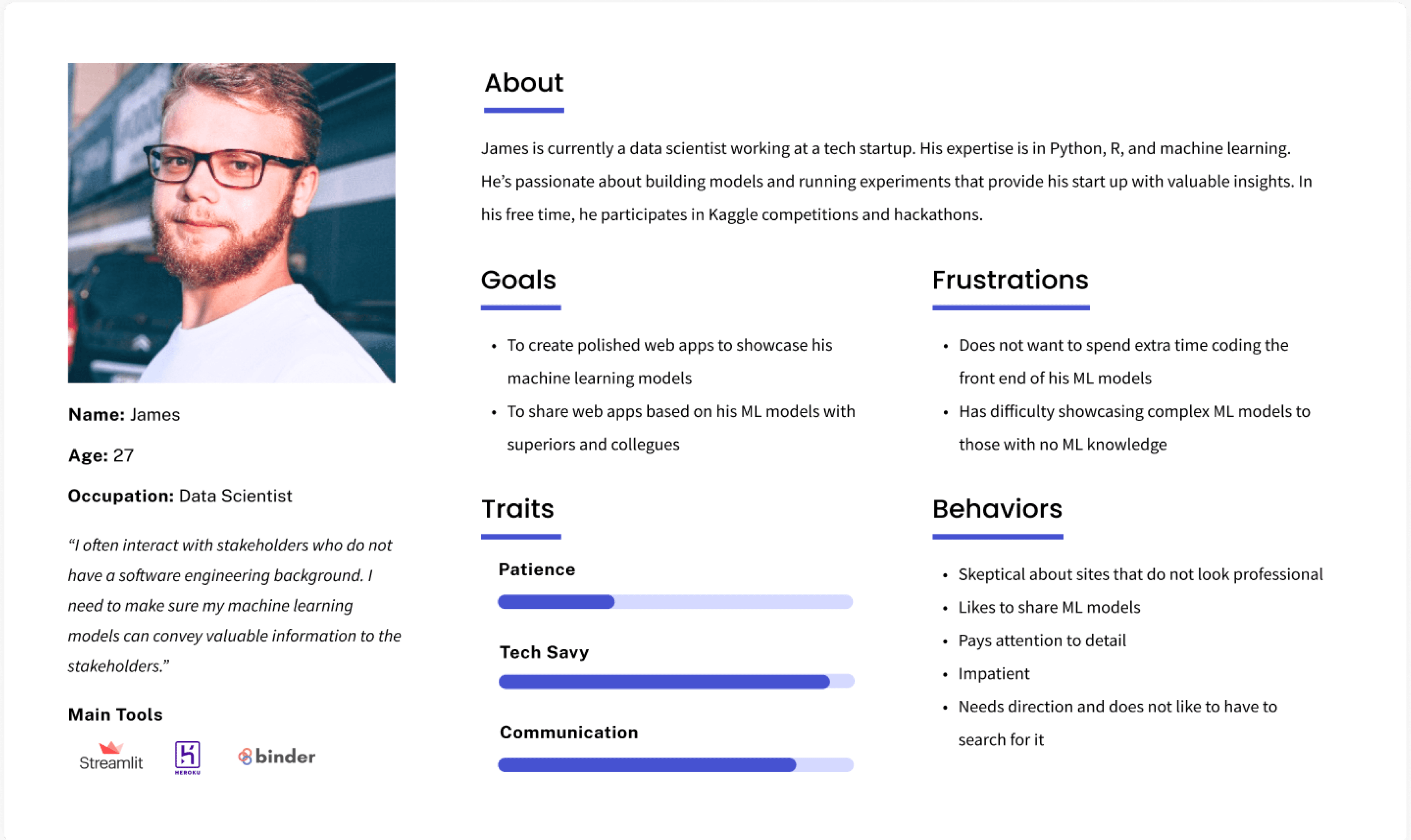
Identifying the target user.
From the insights gathered through extensive user interviews, we successfully refined our target user profile.
Gathering this research gave us a solid background knowledge on the key use cases for the app builder and key opportunity areas to focus on to help improve the experience.
2.4
User Persona
IMAGE
LANDING PAGE
Building mia’s new experience
Research Findings
From our initial interviews, we discovered a couple key takeaways from our users about the landing page:

4/6 users were not able to 100% understand the purpose of mia
5/6 users wanted to more information about mia
4/6 users expressed that visuals are important to them
3.0
Landing page research findings
IMAGE
Competitive Research
We compared companies that offered similar services to mia and took a look at their landing pages and features to determine the methods that other companies have used to attract and engage users.
What mia’s landing page lacked was clear visuals, call to actions and testimonials which made it difficult for users to understand the benefits to their product, how it works, and if they should trust it.

3.1
Competitive Research
IMAGE
Design iterations
Our goal for the landing page was to clearly communicate Mia's value by showcasing how it works, its benefits, and its various use cases.
Additionally, we aimed to build trust in Mia to encourage user engagement and drive conversions. Below are our findings from testing the new design.
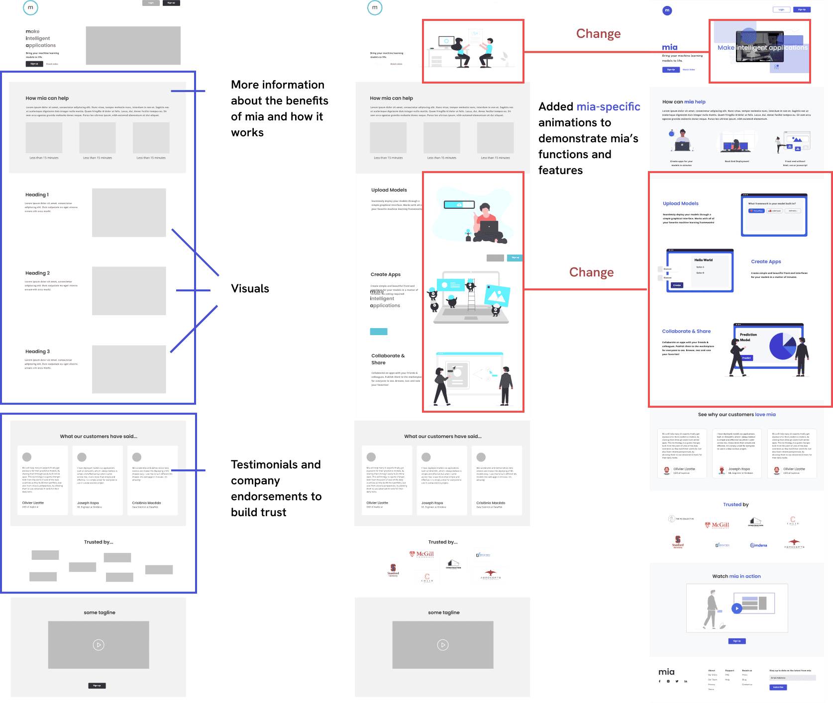
3.3
Landing Page Design iterations
IMAGE
8/8
Participants who have used mia previously reacted positively to the new landing page
7/8
Participants felt that the images were too vague.
In the final iteration, we created animations that served as a sneak peek and tutorial for how mia works.
8/8
Participants were able to better understand the services that mia offers
MODEL UPLOAD
Old Model Upload Process
Before users can create an app, they first needed to upload their machine learning models.
From conducting usability testing with the old process we were able to discover key blockers users encounter while attempting to upload a model

3.3
Model Upload: Usability Findings
IMAGE
New Model Upload Process
In order to simplify the form, we created a one screen form that is interactive and personalized to the user.
Users will first be prompted to select the framework and framework version of their model and then the requirements for that specific framework would populate the screen. This makes sure that users only see the relevant information.
4.1
Model Upload
VIDEO LOOP
APP CREATION
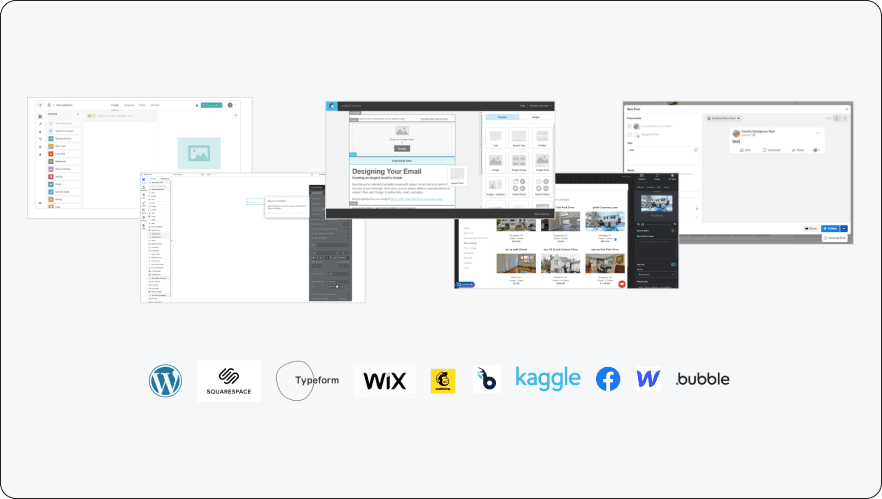
Learning from the best.
Many users described the app creation process as dull and tedious. To address this, we drew inspiration from various "builder-style" platforms, such as MailChimp, Wix, and Typeform
3.3
Element Reuse
IMAGE
Choosing a design direction to move forward with.
One key issue we identified was that users were entering the app creation process without a clear idea of what their app would look like until the very end.
Since these apps visually represent their machine learning models, it's crucial for users to see their progress in real-time during the creation process.
To address this, we developed and A/B tested two solutions in which majority of users preferred the Builder Design approach.

Builder Design
Forum Builder
4.1
A/B Testing
VIDEO LOOP
Forum Builder:
Retaining the existing form builder but displaying a live preview of the app next to the form, updating in real-time as users input data.
Builder Design (User Favorite):
Introducing a drag-and-drop interface with a side panel for editing.
App Creation Final Design
After deciding on the 'Builder Design', we created different iterations of the design and continued to test with users. While testing our final iteration.
6/8 fully understood how to navigate through the builder and create their own app.
View New Changes
3.5
Final App Creation flow
INTERACTIVE
VISUAL DESIGN
Accessibility Issues
During our interviews, 12 out of 17 participants shared negative feedback about Mia's inconsistent UI, with some describing it as untrustworthy and unprofessional.
Our goal was to develop a new design system that feels polished, fosters trust, and authentically represents mia's identity.
3.3
Accessibility review of mia’s old experience
IMAGE
Color palette
We replaced the teal blue with a dark purple-blue and a vibrant blue. The blue was chosen to inspire trust, while the purple-blue adds a modern, tech-savvy, and creative touch.
4.1
Color Palette
IMAGE
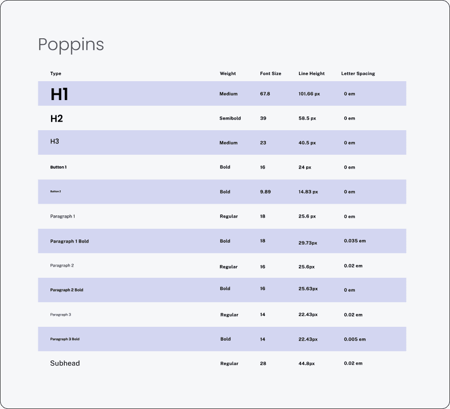
Typography
Mia's original primary font was 'Quicksand,' which we appreciated for its modern, creative, and youthful roundness. However, at larger sizes, its rounded corners became more noticeable, giving it a "comicy" feel.
To address this, we recommended 'Poppins,' which retains Quicksand's rounded charm but with cleaner, straighter edges.
4.1
Typography Comparison
IMAGE
Poppins
Type
Weight
Font Size
Line Height
Letter Spacing
H1
Medium
67.8
101.66 px
0 em
9.89
14.83 px
0 em
0 em
0.035 em
0.02 em
0 em
0.02 em
0.02 em
0.005 em
16
25.63px
23
40.5 px
0 em
18
29.73px
14
22.43px
39
58.5 px
0 em
18
25.6 px
14
22.43px
16
24 px
0 em
16
25.6px
28
44.8px
Semibold
Medium
Bold
Bold
Regular
Bold
Regular
Bold
Regular
Bold
Regular
H2
H3
Button 1
Button 2
Paragraph 1
Paragraph 1 Bold
Paragraph 2
Paragraph 2 Bold
Paragraph 3
Paragraph 3 Bold
Subhead
4.1
Typography
IMAGE
Project Takeaways:
🔑 Communication is key
Communication is key
Communication is key
This project provided me with valuable experience communicating with clients on a consistent basis and it was a great chance for me to learn how to communicate and do research on target users who I don't have a lot of background knowledge on.
🌟 Embrace the process and learn along the way
Embrace the process and learn along the way
Embrace the process and learn along the way
I learned a lot of techniques to improve my own design workflow while providing my teammates with design principles I picked up while I was a graphic designer.
MAIN
Work
Info
CONTACT
Resume
© 2024 Bevan Alomepe. All Rights Reserved.
Made with Framer
Last updated by Bevan on December 3 , 2024, 4:04 PM CST