
Jennair Smart Wall Oven
Whirlpool — January 2023

My Role
UX Lead — Interaction Design, Wireframing, User Flows, Rapid Prototyping
Team
Emillo Fagundes (PM)
Andrew Drees (LE)
Donatello Perillo (UI)
Kavan Shaw (SWE)
Mario Gonzalez (MGK)
Anna Carl (Food Sci)
Platform
Android HMI display
Timeline & Status
14 Months, Set to launch end of 2024
Impact
Testing with end users was well received with an overall usability rating of 4.53/5
Overview
Led UX design for JennAir's $1M+ smart appliance playing a critical role in these domains:
Experience Strategy
I created the frameworks and prototypes to share the vision, design principles and content strategy. This helped evangelize ideas, gain alignment and drive decision making.
Planning & Scope Definition
I defined the product with project mangers & marketing. I evangelized customer goals and balanced business goals. Prioritized and negotiated features for launch and beyond.
Design Execution & Validation
I designed down on Jennair’s Androids HMI experience executed user flows, wireframes, and design specs.

HIGHLIGHTS
An end-to-end luxury appliance that takes control of smart features that empower users to monitor and remotely control their oven.
0.1
Clock view motion concept.
VIDEO LOOP
0.2
Assisted Cooking Motion Concept
VIDEO LOOP
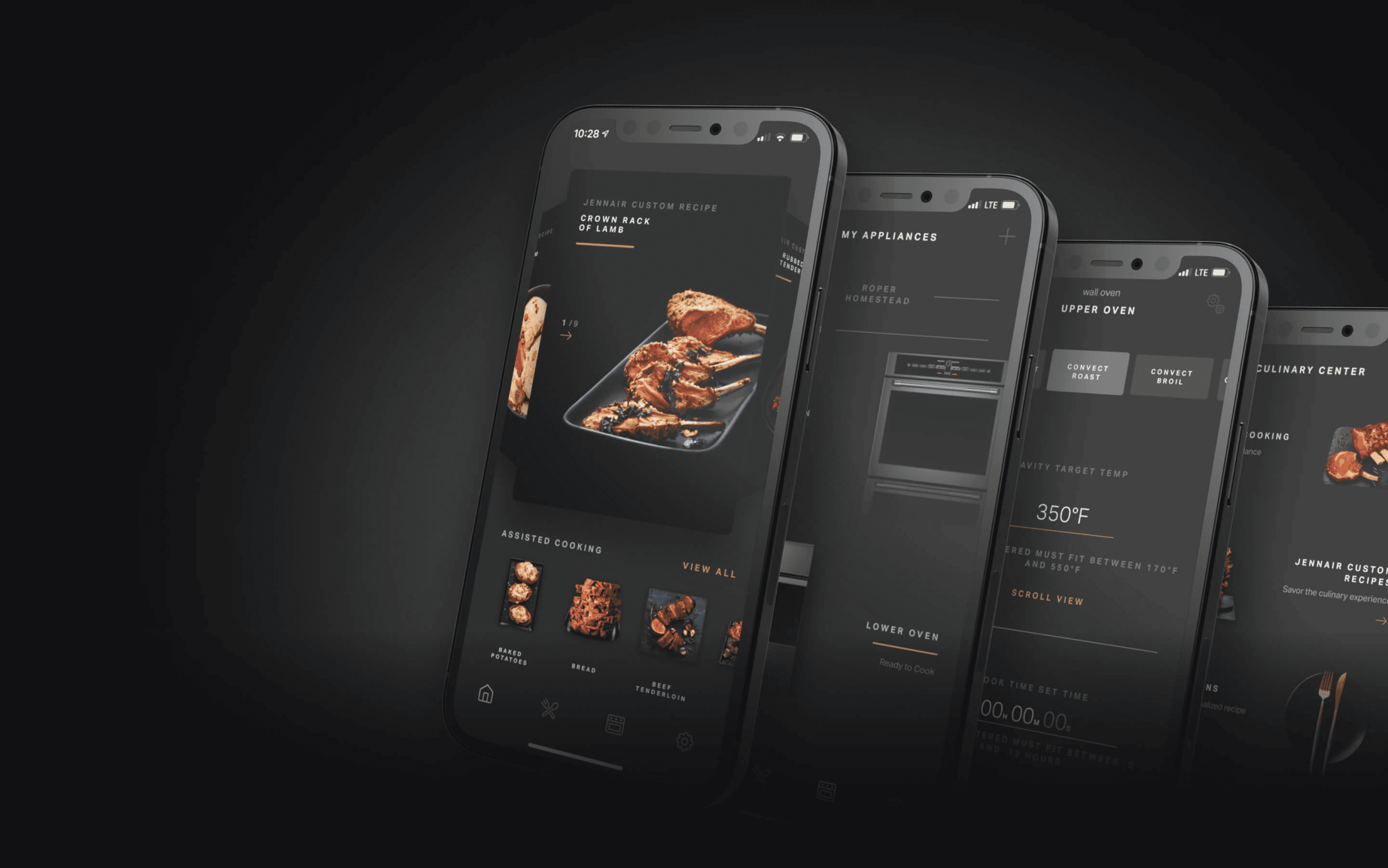
0.3
Mobile Views
IMAGE
0.4
Microwave Motion Concept
VIDEO LOOP
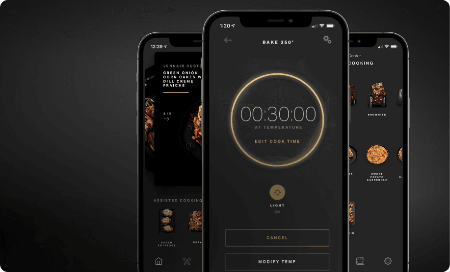
0.5
Kitchen Timer View
IMAGE
CONTEXT
A New Product Launch
Getting up to speed with competitors.
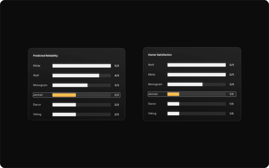
Since 2020, JennAir had not launched a new wall oven, as shown in (Figure 1.0) overall product reliability and owner Satisfaction was at an all time low and Whirlpool aimed to introduce a new line that is able to contend with today's market.
1.0
Consumer reports 2022, 2023, 2024 Spring Surveys
IMAGE
1.1
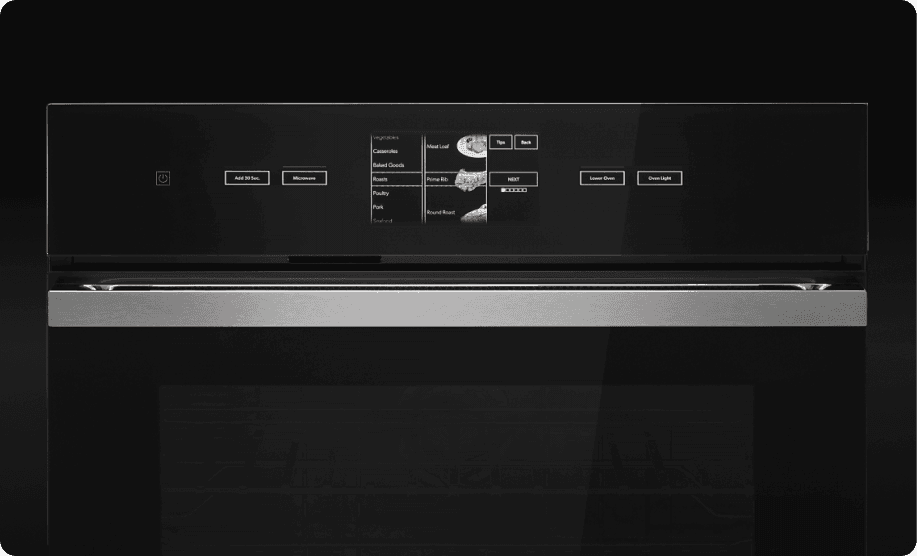
Old Jenn Air wall oven
IMAGE
THE PROBLEM
A fixed launch date
Aggressive scope created an intense environment with many challenges.
Feature design and development were broken into separate work streams executed in a agile-waterfall hybrid model.
I led the design for all aspects related to the on product experience ensuring the experience could be translated to the app.
Working backwards from a fixed launch date, meant that design was subsumed into an engineering‐driven process. Sign‐off milestones were driven by engineering estimates and time to create the right design was the time left over.

THE CHALLENGE
Satiate the indulging consumer by creating an elegant, refined experience between appliance and app that’s competitive in today’s market.
DISCOVERY
Setting the stage
Consumer Research
Leveraged consumer research gathered by the marketing team to drive our planning phase.
The key insights shown in (Figure 2.0) helped me define the design principles.

2.0
Consumer Research
IMAGE
FRAMEWORK
How we got there
Balancing design progress with collaboration in a global, cross-functional team was challenging.
Coordinating with various stakeholders often led to prolonged debates over design decisions, especially when data to inform these choices was lacking. This caused delays, decision paralysis, and a growing skepticism towards design intent.
Recognizing this early, I developed documentation to clearly articulate design rationale and reduce dependency on data-driven debates streamlining our process and improving team alignment (Figure 3.0).

3.0
North Star Design Principles
IMAGE
BUSINESS GOAL
Strengthen value proposition for Culinary Center.
My earliest design challenge was to propose how we would re-organize the placement of features on the programming view to minimize frustrating steps unnecessary steps & highlight specialized branded features.
Shown in (Figure 3.1), categorization for features on the old oven was non-existent and the vertical tumbler made it very difficult for users to find the specific cooking function they were looking for which added unnecessary churn to the cooking journey.
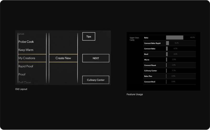
3.1
Old wall oven & Feature Usage Data
IMAGE
Finding a new structure amidst the chaos.
Based on the feature usage data Shown in (Figure 3.1), I was able to understand the most used frequently used features which assisted in building the core structure of the programming view.
Additionally, one of main business goals was to include a section to highlight branded features. I used this information to build out the core programming structure

3.2
Programing View New Contextual Placement of Features.
IMAGE
The new and revamped programming
view.
The new structure Shown in (Figure 3.2) reduced the amount of scrolling needed minimize frustrating steps while providing a dedicated section for frequently used cooking functions to be easily access.
This also allowed for a dedicated space to highlight specialized branded features which helped distinguish us from competitors and opened up new opportunity areas to explore ways to optimize and personalize the experience for users.
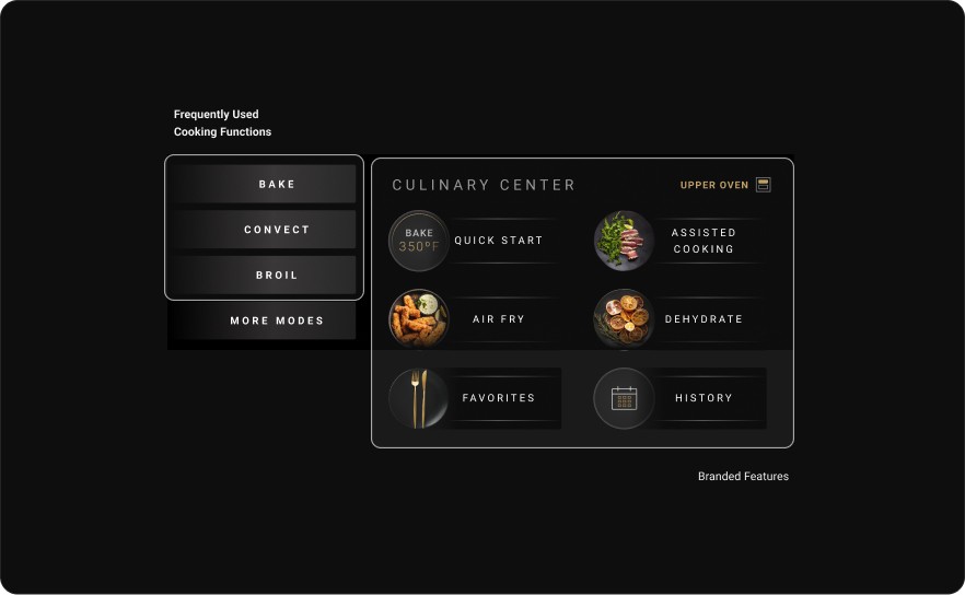
3.2
Revamped Programming View.
IMAGE
BUSINESS GOAL
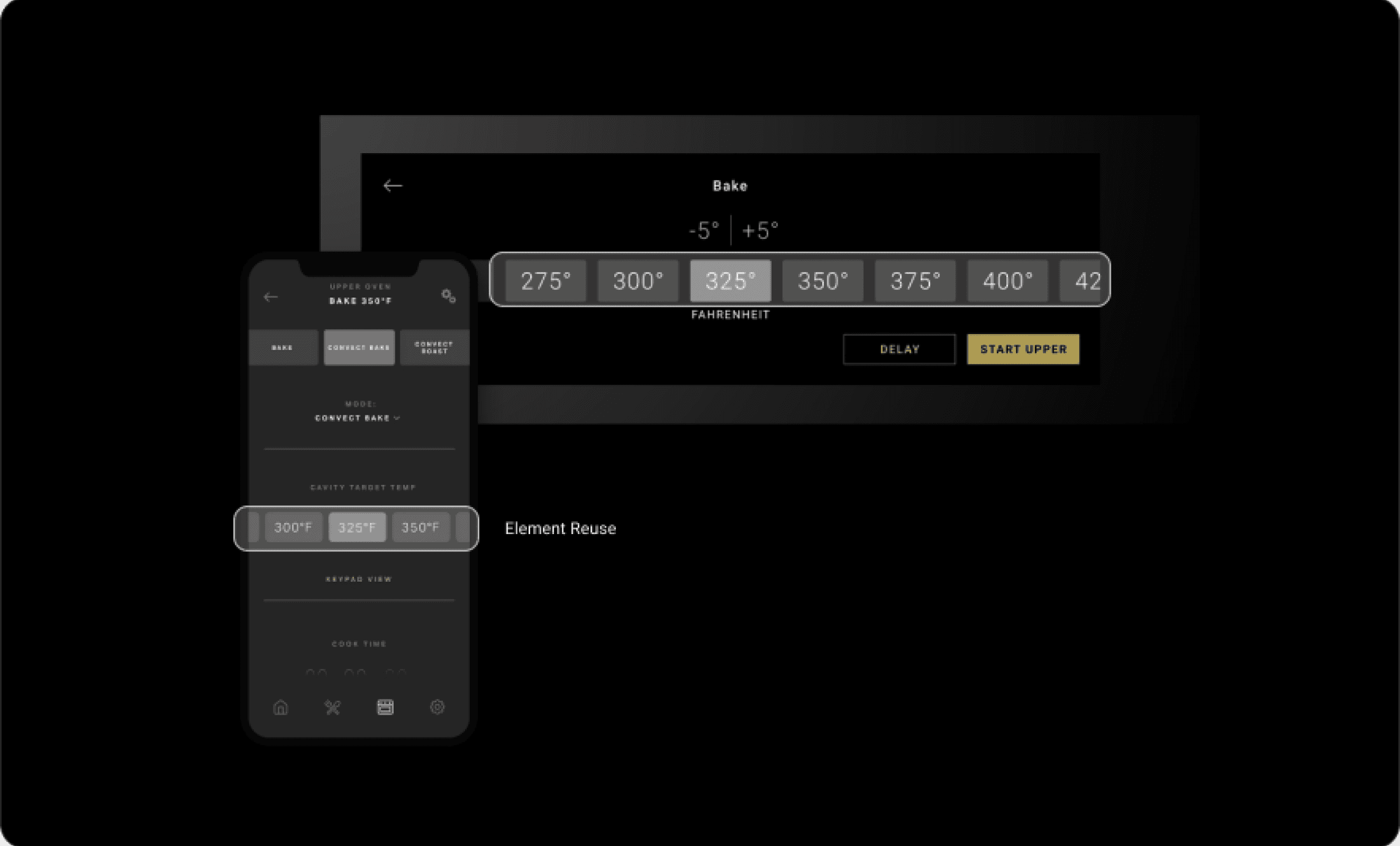
Consistency between the app and on product experience.
During the development of the product flows it was essential to leverage the app design components as much as possible to ensure a consistent and cohesive experience.
The impact of doing this during development of the on product flows allowed for less revision and rework software engineers in later stages of development for the app.

3.3
Element Reuse
IMAGE
THE PROCESS
Communicating Design
Heavy Documentation with a ton of maintenance.
The sheer size of this project meant that I needed to have everything figured out before teams would commit to moving forward with the work. Many teams involved in the project needed to see it in a tangible document.
This risk averse mindset meant I created a lot of reference documentation that was widely distributed and a high overhead to maintain.


4.0
Assisted Cooking process flows
IMAGE
Prototyping was the most effective way to gain meaningful feedback.
For each feature phase, I went through cycles of requirements, reviews, approvals, detailed specs, handoffs and implementation support.
Based on the feature being developed I would meet with the key stakeholders to gather requirements and then generate process flows translating intent into hi‐fidelity design comps.
Since I was working with many existing design patterns and had a UI designer ready to create new assets if needed, it was relatively easy to move straight into hi‐fidelity designs.
Prototyping was the most effective way to gain meaningful feedback from the team and approval from senior leadership. I was able to easily distribute and recycle flows for on product demos using Figma’s prototyping feature on the android app.

4.1
Brand Review Culinary Center
IMAGE
keeping software engineers up to speed.
After hand-off of a feature it was essential to review version updates with software engineers keeping them up to speed since requirements were ever-changing and new version updates of the design system were being released frequently.
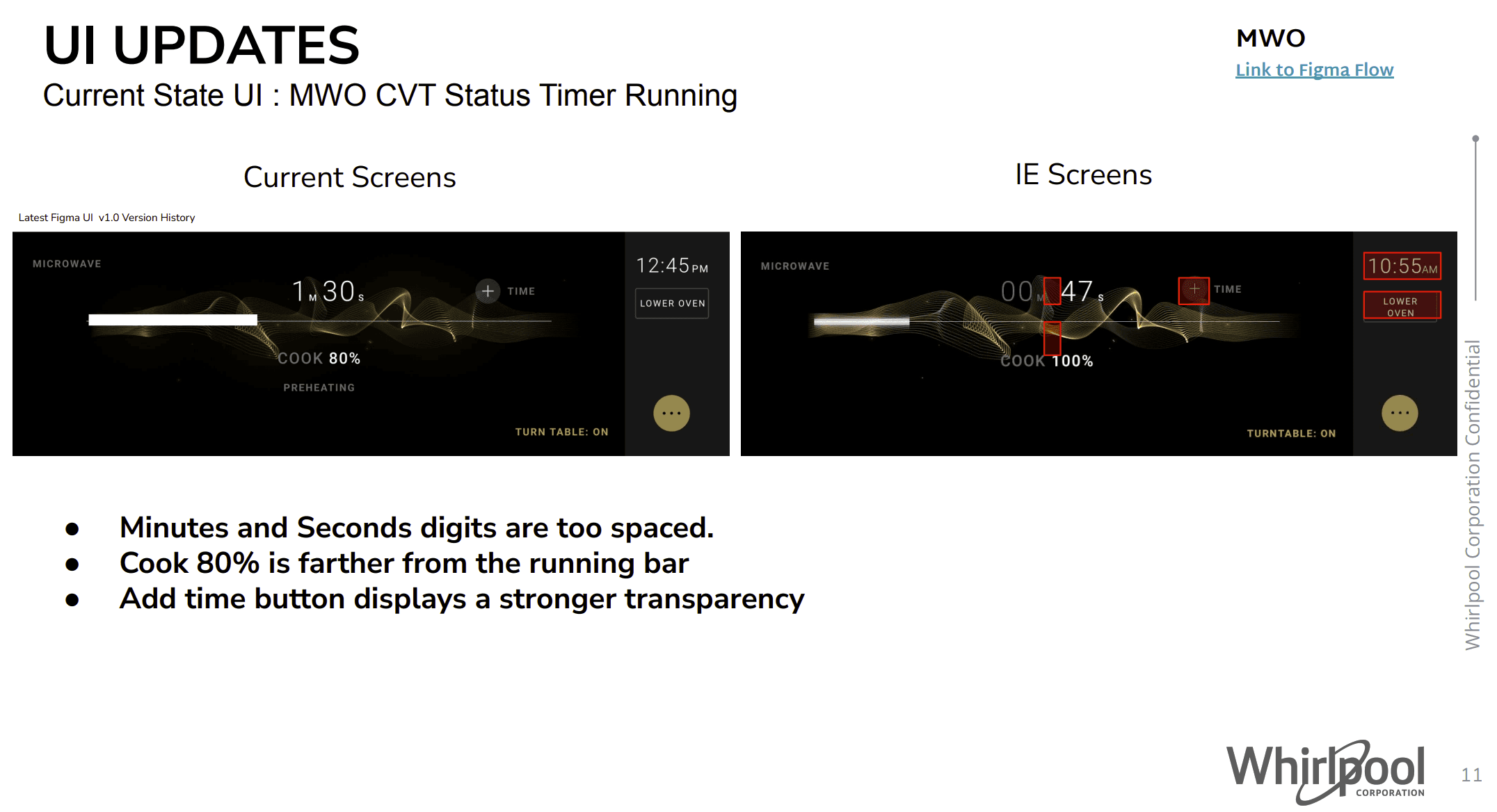
4.2
Integration Events: UI Updates
IMAGE
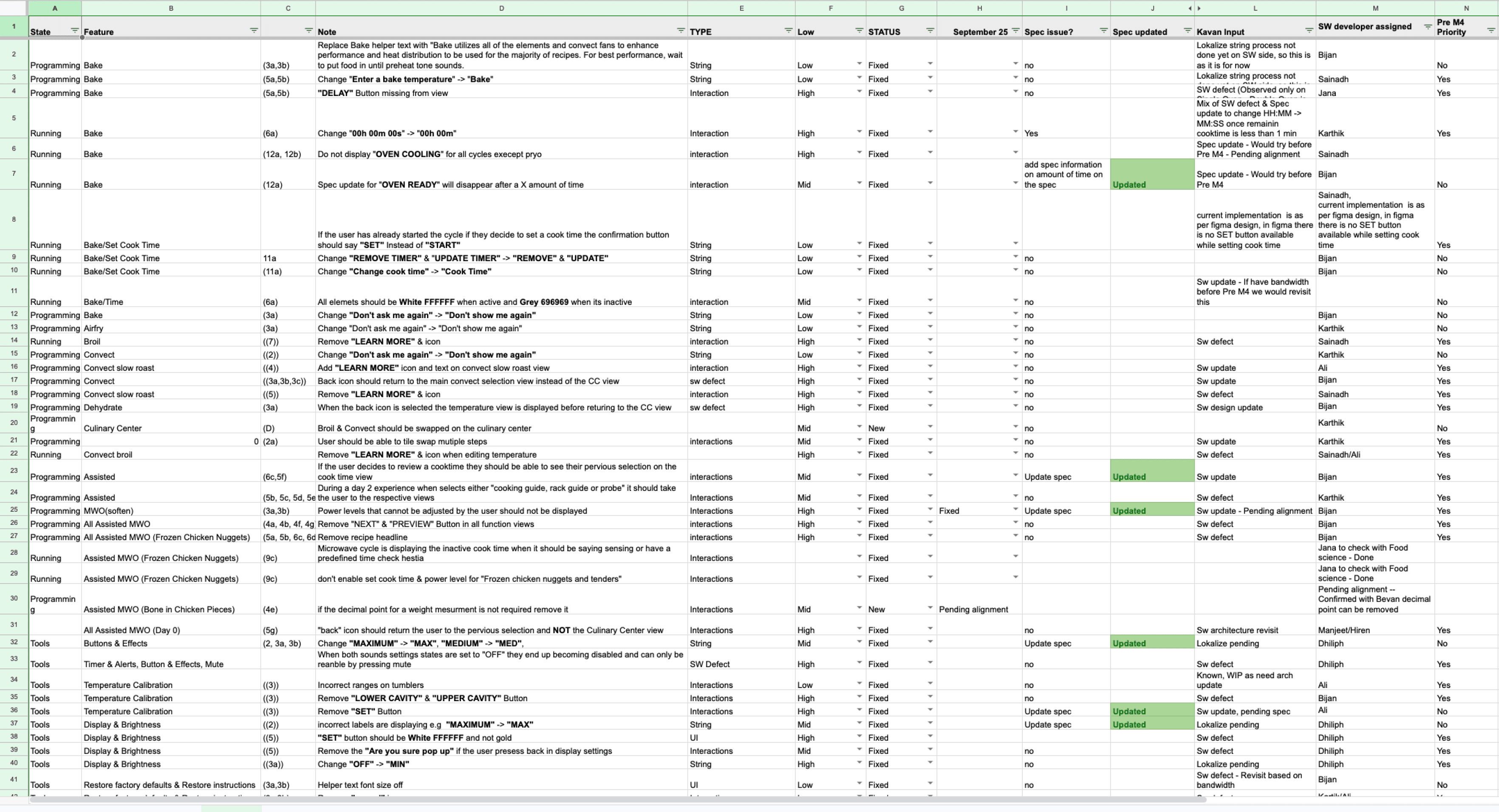
Documentation ensured design intent was not lost in translation.
Over the course of the the project these integration events allowed me to identify over 150+ inconsistencies which were tracked and documented.
Having documentation of the inconsistencies ensured the fixes were implemented and design intent was not lost in translation.
4.3
Software Evaluation
IMAGE
FINAL DESIGNS
An effortless experience
Standby Mode
Quickly catch a glimpse of the current time on the Home Screen and in StandBy Mode with the ability to customize your aesthetic in settings.
5.0
StandBy Mode motion concept.
VIDEO LOOP
Quick Start
Purposefully blends aesthetics and motion to convey a sense of readiness and responsiveness to the element.
Users can start a cooking cycle in less than 3 steps.
5.1
Quick Start motion concept.
VIDEO LOOP
Oven Swap
Swap between cavities to effectively cook multiple meals on your combination or double wall oven.

5.2
Oven Swap motion concept.
VIDEO LOOP
Assisted Cooking
Guided, tailored cooking recipes that take into account individual preferences and the type of dish being prepared ensuring perfect culinary creations.

5.3
Assisted Cooking motion concept.
VIDEO LOOP
Temperature Input
Users are able to enter the precise temperature they want to cook with via slider or numpad to get the results they expect.
5.4
Temperature Input motion concept.
VIDEO LOOP
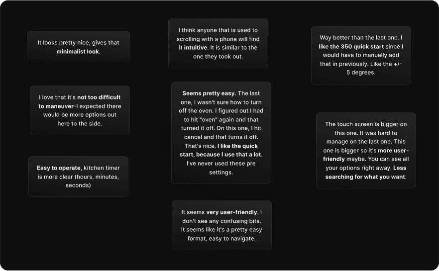
THE IMPACT
Positive sentiments from end users

A HUGE SUCCESS
Testing with end users was well received with an overall usability rating of 4.53/5
It looks pretty nice, gives that minimalist look.
I love that it's not too difficult to maneuver-I expected there would be more options out here to the side.
I think anyone that is used to scrolling with a phone will find it intuitive. It is similar to the one they took out.
Way better than the last one. I like the 350 quick start since I would have to manually add that in previously. Like the +/- 5 degrees.
Easy to operate, kitchen timer is more clear (hours, minutes, seconds)
It seems very user-friendly. I don't see any confusing bits.
It seems like it's a pretty easy format, easy to navigate.
The touch screen is bigger on this one. It was hard to manage on the last one. This one is bigger so it's more user-friendly maybe. You can see all your options right away. Less searching for what you want.
Seems pretty easy. The last one, I wasn't sure how to turn off the oven. I figured out I had to hit "oven" again and that turned it off. On this one, I hit cancel and that turns it off. That's nice. I like the quick start, because I use that a lot. I've never used these pre settings.
6.0
Initial reactions
IMAGE
Project Takeaways:
Effectively communicating with stakeholders is a cheat code
It helped diplomatically address disagreements and propose solutions that satisfy both user and business needs, which was crucial for driving design work forward and making a meaningful impact.
Cross-functional partners should be
involved from the start
It ensured that the project was progressing
holistically — effectively accounting for content
strategy and technical feasibility early.
Finding opportunities within constraints
Viewing constraints from different perspectives
helped brew new approaches to tackle other
constraints.
My Role
UX Lead — Interaction Design, Wireframing, User Flows, Rapid Prototyping
UX Lead — Interaction Design, Wireframing, User Flows, Rapid Prototyping
UX Lead — Interaction Design, Wireframing, User Flows, Rapid Prototyping
Team
Emillo Fagundes (PM)
Andrew Drees (LE)
Donatello Perillo (UI)
Kavan Shaw (SWE)
Mario Gonzalez (MGK)
Anna Carl (Food Sci)
Emillo Fagundes (PM), Andrew Drees (LE), Donatello Perillo (UI), Kavan Shaw (SWE)
Mario Gonzalez (MGK), Anna Carl (Food Sci)
Platform
Android HMI display
Android HMI display
Timeline & Status
14 Months, Set to launch end of 2024
14 Months, Set to launch end of 2024
Impact
Testing with end users was well received with an overall usability rating of 4.53/5
Overview
Led UX design for JennAir's $1M+ smart appliance playing a critical role in these domains:
Experience Strategy
I created the frameworks and prototypes to share the vision, design principles and content strategy. This helped evangelize ideas, gain alignment and drive decision making.
Planning & Scope Definition
I defined the product with project mangers & marketing. I evangelized customer goals and balanced business goals. Prioritized and negotiated features for launch and beyond.
Design Execution & Validation
I designed down on Jennair’s Androids HMI experience executed user flows, wireframes, and design specs.

HIGHLIGHTS
An end-to-end luxury appliance that takes control of smart features that empower users to monitor and remotely control their oven.
0.1
Clock view motion concept.
VIDEO LOOP
0.2
Assisted Cooking Motion Concept
VIDEO LOOP

0.3
Mobile views
IMAGE
0.5
Kitchen Timer View
IMAGE
0.4
Microwave Motion Concept
VIDEO LOOP
HIGHLIGHTS
An end-to-end luxury appliance that takes control of smart features that empower users to monitor and remotely control their oven.
0.1
Clock view motion concept.
VIDEO LOOP
0.2
Assisted Cooking Motion Concept
VIDEO LOOP
0.3
Mobile views
IMAGE
0.5
Kitchen Timer View
IMAGE
0.4
Microwave Motion Concept
VIDEO LOOP
CONTEXT
A New Product Launch
A New Product Launch
Getting up to speed with competitors
Since 2020, JennAir had not launched a new wall oven, as shown in (Figure 1.0) overall product reliability and owner Satisfaction was at an all time low and Whirlpool aimed to introduce a new line that is able to contend with today's market.
1.0
Consumer reports 2022, 2023, 2024 Spring Surveys
IMAGE
1.1
Old Jenn Air wall oven
IMAGE
THE PROBLEM
A fixed launch date
Aggressive scope created an intense environment with many challenges.
Feature design and development were broken into separate work streams executed in a agile-waterfall hybrid model.
I led the design for all aspects related to the on product experience ensuring the experience could be translated to the app.
Working backwards from a fixed launch date, meant that design was subsumed into an engineering‐driven process. Sign‐off milestones were driven by engineering estimates and time to create the right design was the time left over.

THE CHALLENGE
Satiate the indulging consumer by creating an elegant, refined experience between appliance and app that’s competitive in today’s market.
THE CHALLENGE
Satiate the indulging consumer by creating an elegant, refined experience between appliance and app that’s competitive in today’s market.
THE CHALLENGE
Satiate the indulging consumer by creating an elegant, refined experience between appliance and app that’s competitive in today’s market.
CONTEXT
THE PROBLEM
A New Product Launch
A fixed launch date
Getting up to speed with competitors
Aggressive scope created an intense environment with many challenges.
Feature design and development were broken into separate work streams executed in a agile-waterfall hybrid model.
I led the design for all aspects related to the on product experience ensuring the experience could be translated to the app.
Working backwards from a fixed launch date, meant that design was subsumed into an engineering‐driven process. Sign‐off milestones were driven by engineering estimates and time to create the right design was the time left over.
DISCOVERY
Setting the stage
Consumer Research
Leveraged consumer research gathered by the marketing team to drive our planning phase.
The key insights shown in (Figure 2.0) helped me define the design principles.
2.0
Consumer Research
IMAGE
THE PROBLEM
DISCOVERY
A fixed launch date
Setting the stage
Aggressive scope created an intense environment with many challenges.
Consumer Research
Feature design and development were broken into separate work streams executed in a agile-waterfall hybrid model.
I led the design for all aspects related to the on product experience ensuring the experience could be translated to the app.
I leveraged consumer research gathered by the marketing team to drive our planning phase.
The key insights shown in (Figure 2.0) helped me define the design principles.
FRAMEWORK
How we got there
Balancing design progress with collaboration in a global, cross-functional team was challenging.
Coordinating with various stakeholders often led to prolonged debates over design decisions, especially when data to inform these choices was lacking. This caused delays, decision paralysis, and a growing skepticism towards design intent.
Recognizing this early, I developed documentation to clearly articulate design rationale and reduce dependency on data-driven debates streamlining our process and improving team alignment (Figure 3.0).
3.0
North Star Design Principles
IMAGE
BUSINESS GOAL
Strengthen value proposition for Culinary Center.
My earliest design challenge was to propose how we would re-organize the placement of features on the programming view to minimize frustrating steps unnecessary steps & highlight specialized branded features.
Shown in (Figure 3.1), categorization for features on the old oven was non-existent and the vertical tumbler made it very difficult for users to find the specific cooking function they were looking for which added unnecessary churn to the cooking journey.
3.1
Old wall oven & Feature Usage Data
IMAGE
Finding a new structure amidst the chaos.
Finding a new structure amidst
the chaos.
Based on the feature usage data Shown in (Figure 3.1), I was able to understand the most used frequently used features which assisted in building the core structure of the programming view.
Additionally, one of main business goals was to include a section to highlight specialized branded features. I used this information to build out the core programming structure
3.1
First prototype flow, categorized.
IMAGE
The new and revamped programming
view.
The revamped programming
view.
The new structure Shown in (Figure 3.2) reduced the amount of scrolling needed minimize frustrating steps while providing a dedicated section for frequently used cooking functions to be easily access.
This also allowed for a dedicated space to highlight specialized branded features which helped distinguish us from competitors and opened up new opportunity areas to explore ways to optimize and personalize the experience for users.
3.2
First prototype flow, categorized.
IMAGE
BUSINESS GOAL
Consistency between the app and on product experience.
During the development of the product flows it was essential to leverage the app design components as much as possible to ensure a consistent and cohesive experience.
The impact of doing this during development of the on product flows allowed for less revision and rework software engineers in later stages of development for the app.
3.3
Element Reuse
IMAGE
DISCOVERY
FRAMEWORK
Setting the stage
How we got there
Balancing design progress with collaboration in a global, cross-functional team was challenging.
I leveraged consumer research gathered by the marketing team to drive our planning phase.
The key insights shown in (Figure 2.0) helped me define the design principles.
Coordinating with various stakeholders often led to prolonged debates over design decisions, especially when data to inform these choices was lacking. This caused delays, decision paralysis, and a growing skepticism towards design intent.
Recognizing this early, I developed documentation to clearly articulate design rationale and reduce dependency on data-driven debates streamlining our process and improving team alignment (Figure 3.0).
PROCESS
Communicating Design
Heavy Documentation with a ton of maintenance.
The sheer size of this project meant that I needed to have everything figured out before teams would commit to moving forward with the work. Many teams involved in the project needed to see it in a tangible document.
This risk averse mindset meant I created a lot of reference documentation that was widely distributed and a high overhead to maintain.
4.0
Assisted Cooking process flows
IMAGE
Prototyping was the most effective way to gain meaningful feedback.
For each feature phase, I went through cycles of requirements, reviews, approvals, detailed specs, handoffs and implementation support.
Based on the feature being developed I would meet with the key stakeholders to gather requirements and then generate process flows translating intent into hi‐fidelity design comps.
Since I was working with many existing design patterns and had a UI designer ready to create new assets if needed, it was relatively easy to move straight into hi‐fidelity designs.
Prototyping was the most effective way to gain meaningful feedback from the team and approval from senior leadership. I was able to easily distribute and recycle flows for on product demos using Figma’s prototyping feature on the android app.
4.1
Brand Review Culinary Center
IMAGE
keeping software engineers up to speed.
After hand-off of a feature it was essential to review version updates with software engineers keeping them up to speed since requirements were ever-changing and new version updates of the design system were being released frequently.
Prototyping was the most effective way to gain meaningful feedback.
Keeping software engineers up to speed.
For each feature phase, I went through cycles of requirements, reviews, approvals, detailed specs, handoffs and implementation support.
Based on the feature being developed I would meet with the key stakeholders to gather requirements and then generate process flows translating intent into hi‐fidelity design comps.
Since I was working with many existing design patterns and had a UI designer ready to create new assets if needed, it was relatively easy to move straight into hi‐fidelity designs.
Prototyping was the most effective way to gain meaningful feedback from the team and approval from senior leadership. I was able to easily distribute and recycle flows for on product demos using Figma’s prototyping feature on the android app.
After hand-off of a feature it was essential to review version updates with software engineers keeping them up to speed since requirements were ever-changing and new version updates of the design system were being released frequently.

4.2
Integration Events: UI Updates
IMAGE
Documentation ensured design intent was not lost in translation.
Over the course of the the project these integration events allowed me to identify over 150+ inconsistencies which were tracked and documented.
Having documentation of the inconsistencies ensured the fixes were implemented and design intent was not lost in translation.
Keeping software engineers up to speed.
Documentation ensured design intent was not lost in translation.
After hand-off of a feature it was essential to review version updates with software engineers keeping them up to speed since requirements were ever-changing and new version updates of the design system were being released frequently.
Over the course of the the project these integration events allowed me to identify over 150+ inconsistencies which were tracked and documented.
Having documentation of the inconsistencies ensured the fixes were implemented and design intent was not lost in translation.
4.3
Software Evaluation
IMAGE
Heavy Documentation with a ton of maintenance.
Prototyping was the most effective way to gain meaningful feedback.
The sheer size of this project meant that I needed to have everything figured out before teams would commit to moving forward with the work. Many teams involved in the project needed to see it in a tangible document.
This risk averse mindset meant I created a lot of reference documentation that was widely distributed and a high overhead to maintain.
For each feature phase, I went through cycles of requirements, reviews, approvals, detailed specs, handoffs and implementation support.
Based on the feature being developed I would meet with the key stakeholders to gather requirements and then generate process flows translating intent into hi‐fidelity design comps.
Since I was working with many existing design patterns and had a UI designer ready to create new assets if needed, it was relatively easy to move straight into hi‐fidelity designs.
Prototyping was the most effective way to gain meaningful feedback from the team and approval from senior leadership. I was able to easily distribute and recycle flows for on product demos using Figma’s prototyping feature on the android app.
FRAMEWORK
PROCESS
How we got there
Communicating Design
Balancing design progress
with collaboration in a global, cross-functional team was challenging.
Heavy Documentation with a ton of maintenance.
Coordinating with various stakeholders often led to prolonged debates over design decisions, especially when data to inform these choices was lacking. This caused delays, decision paralysis, and a growing skepticism towards design intent.
Recognizing this early, I developed documentation to clearly articulate design rationale and reduce dependency on data-driven debates streamlining our process and improving team alignment (Figure 3.0).
The sheer size of this project meant that I needed to have everything figured out before teams would commit to moving forward with the work. Many teams involved in the project needed to see it in a tangible document.
This risk averse mindset meant I created a lot of reference documentation that was widely distributed and a high overhead to maintain.
FINAL DESIGNS
An effortless experience
Standby Mode
Quickly catch a glimpse of the current time on the Home Screen and in StandBy Mode with the ability to customize your aesthetic in settings.
5.0
StandBy Mode motion concept.
VIDEO LOOP
Quick Start
Purposefully blends aesthetics and motion to convey a sense of readiness and responsiveness to the element.
Users can start a cooking cycle in less than 3 steps.
Oven Swap
Swap between cavities to effectively cook multiple meals on your combination or double wall oven.
Assisted Cooking
Guided, tailored cooking recipes that take into account individual preferences and the type of dish being prepared ensuring perfect culinary creations.
Freedom of Temperature
Input
Users are able to enter the precise temperature they want to cook with via slider or numpad to get the results they expect.
5.4
Temperature Input motion concept.
VIDEO LOOP
5.3
Assisted Cooking motion concept.
VIDEO LOOP
5.2
Oven Swap motion concept.
VIDEO LOOP
5.1
Quick Start motion concept.
VIDEO LOOP
Standby Mode
Quick Start
Quickly catch a glimpse of the current time on the Home Screen and in StandBy Mode with the ability to customize your aesthetic in settings.
Purposefully blends aesthetics and motion to convey a sense of readiness and responsiveness to the element. Users can start a cooking cycle in less than 3 steps.
Quick Start
Assisted Cooking
Purposefully blends aesthetics and motion to convey a sense of readiness and responsiveness to the element.
Users can start a cooking cycle in less than 3 steps.
Guided, tailored cooking recipes that take into account individual preferences and the type of dish being prepared ensuring perfect culinary creations.
Assisted Cooking
Freedom of Temperature
Input
Guided, tailored cooking recipes that take into account individual preferences and the type of dish being prepared ensuring perfect culinary creations.
Users are able to enter the precise temperature they want to cook with via slider or numpad to get the results they expect.
Freedom of Temperature
Input
Oven Swap
Users are able to enter the precise temperature they want to cook with via slider or numpad to get the results they expect.
Swap between cavities to effectively cook multiple meals on your combination or double wall oven.
PROCESS
FINAL DESIGNS
Communicating Design
An effortless experience
Heavy Documentation with a ton of maintenance.
Standby Mode
The sheer size of this project meant that I needed to have everything figured out before teams would commit to moving forward with the work. Many teams involved in the project needed to see it in a tangible document.
This risk averse mindset meant I created a lot of reference documentation that was widely distributed and a high overhead to maintain.
Quickly catch a glimpse of the current time on the Home Screen and in StandBy Mode with the ability to customize your aesthetic in settings.
Standby Mode
Quickly catch a glimpse of the current time on the Home Screen and in StandBy Mode with the ability to customize your aesthetic in settings.
THE IMPACT
Positive sentiments from end users

A HUGE SUCCESS
Testing with end users was well received with an overall usability rating of 4.53/5
A HUGE SUCCESS
Testing with end users was well received with an overall usability rating of 4.53/5
A HUGE SUCCESS
Testing with end users was well received with an overall usability rating of 4.53/5
It looks pretty nice, gives that minimalist look.
I love that it's not too difficult to maneuver-I expected there would be more options out here to the side.
I think anyone that is used to scrolling with a phone will find it intuitive. It is similar to the one they took out.
Way better than the last one. I like the 350 quick start since I would have to manually add that in previously. Like the +/- 5 degrees.
Easy to operate, kitchen timer is more clear (hours, minutes, seconds)
It seems very user-friendly. I don't see any confusing bits.
It seems like it's a pretty easy format, easy to navigate.
The touch screen is bigger on this one. It was hard to manage on the last one. This one is bigger so it's more user-friendly maybe. You can see all your options right away. Less searching for what you want.
Seems pretty easy. The last one, I wasn't sure how to turn off the oven. I figured out I had to hit "oven" again and that turned it off. On this one, I hit cancel and that turns it off. That's nice. I like the quick start, because I use that a lot. I've never used these pre settings.
6.0
Initial reactions
IMAGE
Project Takeaways:
Effectively communicating with stakeholders is a cheat code
It helped diplomatically address disagreements and propose solutions that satisfy both user and business needs, which was crucial for driving design work forward and making a meaningful impact.
Cross-functional partners should be involved from the start
It ensured that the project was progressing
holistically — effectively accounting for content strategy and technical feasibility early.
Finding opportunities within constraints
Viewing constraints from different perspectives helped brew new approaches to tackle other
constraints.
FINAL DESIGNS
THE IMPACT
An effortless experience
Positive sentiments from end users
Next project:
Machine Learning Dashboard
MIA '24 — Redesigning an app builder service

Machine Learning Dashboard
MIA '24 — Redesigning an app builder service
Jennair Smart Wall Oven
Jennair Smart Wall Oven
Whirlpool — January 2023